Your Custom Text Here
Developing an app for a socially focused Learning Management System in the Springboard Workshop
In June of 2016, filled with enthusiasm after recently discovering the field of UX, I enrolled in Springboard's UX workshop to further develop my skills and process as a user experience designer.
Why Springboard?

Springboard offers the flexibility of self paced learning and includes weekly online meetings with a mentor, an online community of fellow cohorts, and weekly "office hour" group chats on various UX related topics. The curriculum brings students through the full UX design process from user research to testing a prototype while working on a project of his or her choosing.
Ultimately, the 1:1 meetings with my amazing mentor, Emily, was an invaluable part of my experience, not only in furthering my project but also for her insights and support as I shifted roles at work from print to digital design. I can't thank Emily enough for all her help.
The Project
My Springboard project was inspired by my experiences teaching publication design at Emerson College. I taught at Emerson long enough (ten years!) to experience using two different learning management systems (LMS), WebCT and Canvas. The problem was that neither offered an ideal experience for teaching visual arts courses, with clunky interfaces that were meant more for academics than designers or artists. I often wished there was an easier way to share course content, visual inspiration, or get students more engaged outside the classroom.
Competitive Research
In the beginning, I didn't know this kind of software was known as a learning management syster, or that there are thousands of LMS's available in the market. I made this discovery by falling into a Google rabbit hole and immediately felt overwhelmed. In order to simplify things, I began searching for an LMS specific to visual arts courses. After looking at a multitude of art school and museum websites I finally came across an LMS developed for the North Carolina Museum of Art called Odigia. I chose to compare this with one of the more popular LMS's I came across, Schoology, along with the system I was familiar with from teaching at Emerson, Canvas.
User Surveys and Interviews
After completing my competitive analysis I gathered enough information to ask questions of potential users. Although my experience with using an LMS comes from the perspective of a teacher, I put my own assumptions aside and chose to focus this project, and my questions, entirely on the student experience.
I tailored a survey specifically for visual arts students who took courses in person, hoping to target current or recent students. I then reached out to former students as well as my social networks, receiving nearly forty responses to the survey I conducted using Typeform.
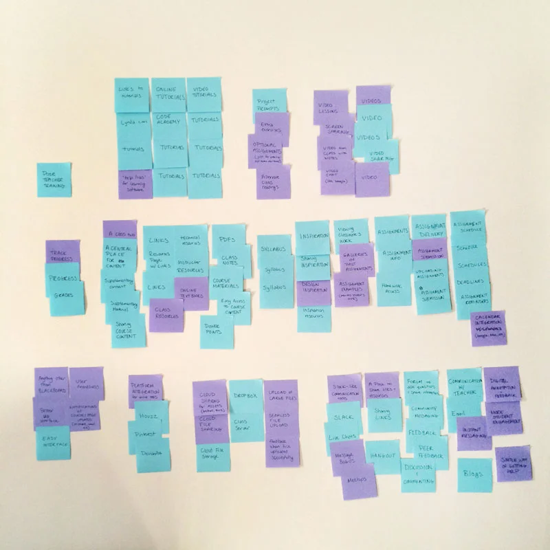
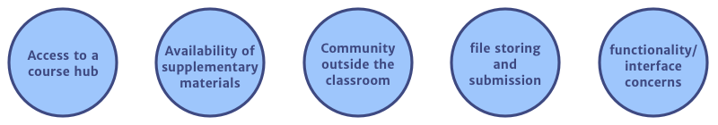
Using an affinity diagram I analyzed the survey results with post-its on my wall and distinguished 5 key user needs:
Once the surveys were complete I was able to further develop my understanding of potential users while conducting user interviews. The interviews gave me the opportunity for a more in-depth exploration of the topics from the survey while also revealing several issues with current learning management systems that I overlooked. For instance, teacher participation can be very low, resulting in the LMS not being a part of the student experience. Or that some students have such a strong will to connect outside of the classroom that they create their own online communities or groups using social media.
These revelations helped pivot my focus from a product that was teacher managed and driven, to one that was student driven. The product would be managed without the presence of teachers, allowing for an uninhibited, socially focused experience for students that inspires collaboration and learning outside the classroom.

Student Persona
From the information gathered in the surveys and interviews I was able to develop a fleshed out student user persona to use as my guide for making design and functionality decisions.
Amelia is a highly motivated creatively curious undergraduate student studying writing, literature and publishing at Emerson College in Boston, MA.
She recently discovered a passion for typography and book design while participating in Emerson's "Pub Club" which produces small print runs of short story collections and novellas by fellow students. After assisting the lead designer on developing an interior design for a book project, she decided to take a class that would teach her basic design and typography skills while learning how to use the Adobe Creative Suite. The class is called Applications for Print Publishing.
She has minimal prior experience in InDesign and Illustrator but is confident in her abilities to learn the software quickly—she's already taught herself basic Photoshop skills in order to work on various photography projects in both high school and college. But she'd prefer to know "the right way" to do things.
Amelia is also an excellent student who cares about her grades, performing well in class, and extending her learning experience outside the classroom. She thrives in group settings, tends to fall into leadership roles amongst her peers, and finds her learning experience more meaningful when she is able to help others understand and learn concepts they are struggling with.
Here are some of Amelia's goals, attitudes and behaviors:

Minimum Viable Product (MVP)
With a clear understanding of user needs I worked on developing user stories in order to identify the features I'd focus on when designing the MVP for the project. I used the following sentence structure to help create user stories:
As a user I want to ____ so that I can ____ .

Some of the different features I explored were:
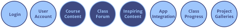
Ultimately I narrowed down the MVP to focus on the three features that were most closely connected to the product's goal of being a socially focused experience that inspires collaboration and learning outside the classroom: course content, a class forum, and inspiring content.
The MVP would be a mobile app so that the user could easily access the LMS anywhere, anytime.
Information Architecture
Before developing a site map or user flows I chose to conduct a remote card sort using the software, Optimal Sort, to help with system categorizing and language. Lesson learned, it's probably more useful to conduct card sorts in person. Although I had a good response rate, the free version of the software limits participants to ten, even if they don't finish the sorting exercise. Only seven of the ten completed the sort.
With only seven responses and nobody physically present to further elaborate during the sorting exercise I was disappointed to find the results confusing and inconsistent. One mistake I made, however, was not choosing wording specific enough to a task. Such as “ask for help” was intended as a task in the class forum, asking peers for help in class. But participants generally placed this in the category “support,” most likely thinking the intention was asking for help in how to use the software. Perhaps being more specific like: "ask peers for help" would have gotten better results.
After the card sort was completed I used what information I could to help with developing the site map.

From there I worked on developing user flows that explored a range of tasks possible in the three main features of the MVP: the class forum, course content, and inspiration. The tasks were: getting feedback on the class forum, reviewing class notes, and downloading the class syllabus.
Developing the user flows was the key to helping me understand the various steps needed to complete a task. I now knew what pages needed to be designed in a wireframe. It also helped me get a clear understanding of the kinds of functionality needed in the software.
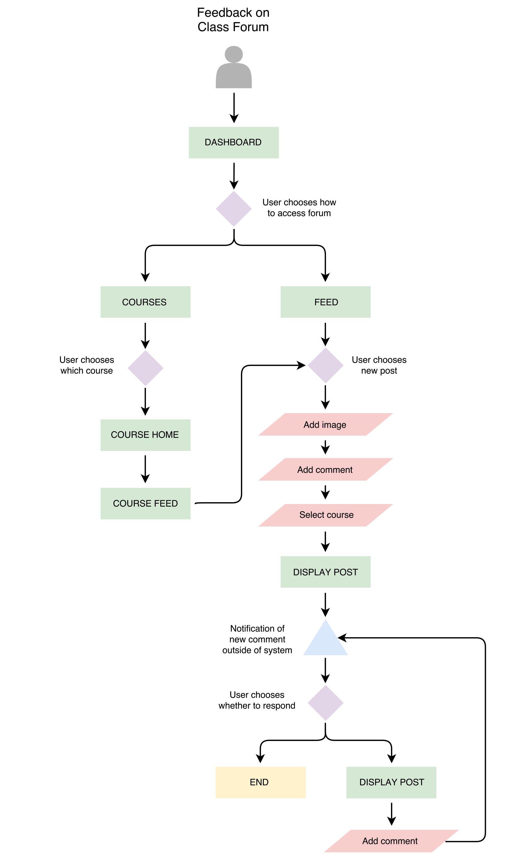

For instance, while determining the flow for the task of asking for feedback in the class forum I realized that the LMS app would need to have both a home feed, where a user would be able to see all of the activity posted to his/her courses, as well as be able to filter and only see what pertained to his/her specific class on a course home page. I also realized that the functionality would need to include a labeling system for each post so it could be categorized under a specific course and it would be clear in the home feed what course the post was from.
Wireframes
At this point I had a good understanding of the pages I needed to develop for my MVP and some of the basic functionality that it should include. It was time to work out how the user interface would be organized. Through a series of iterations first by hand sketching and then low fidelity wireframes in Sketch, I was able to work through many of the details of the user flows I mapped out.
I started with sketching out 3 different user interface ideas for 3 pages in the app: the home feed, the courses list page, and the course home.


After reviewing with my mentor, Emily, I decided to further iterate on concept 3. I then sketched out more pages for the app in the next itereation.
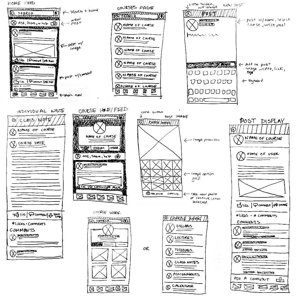
I then started fleshing out more refined wireframes in Sketch, starting with the user flow for getting feedback in the class forum.


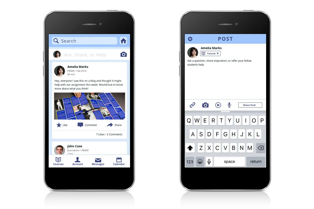
Prototype
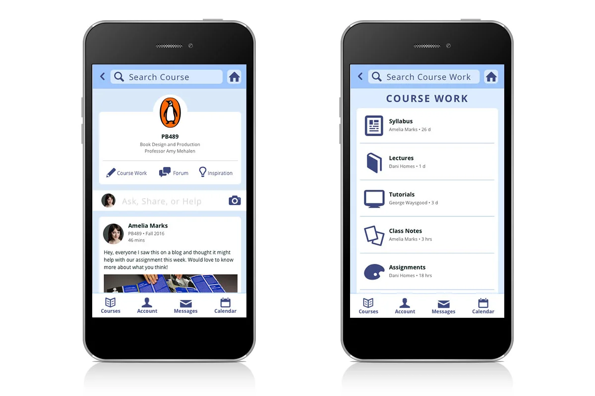
Once all the screens were worked out in wireframes it was time to apply the visual design and create a clickable prototype using Invision.
User Testing
After QA-ing and making a few tweaks to the design and prototype I was ready to test with potential users.
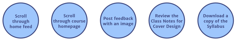
First, I chose the tasks the user would be asked to complete during test, basing them on the user flows developed earlier.
With the tasks chosen I wrote a script for the test. The script first walks the user through the reason for testing the app, making sure he/she knows that it's the app being tested, not him/her. It then briefly introduces the project and the project goals. Finally, before the test starts the scenario is set:
"For this exercise lets assume that you are a graphic design student enrolled in a book design course labeled as PB489. The app is set up from the perspective of a student named Amelia Marks who is very active in the course forum."
The rest of the script walks the user through the above tasks for the course PB489.
Overall the app tested well and the feedback was positive with some minor changes needed. It felt familiar and easy to use. Although some of the course work content in the home and course feeds, like the syllabus or class notes, seemed confusing at first the users generally understood what they were seeing once they gained more experience in the app.
There was some visual confusion distinguishing the search bar from the post bar, which were both white during the test. After testing, the search bar was changed to a complimentary shade of blue to help distinguish each.
The test also reinforced the need for confirmation when finishing a task such as posting a comment or downloading content as users were expecting these validations.
Final Thoughts
I feel so grateful for the opportunity to work through the entire UX process outside of the constraints of my job. This project empowered me to grow my knowledge and skills in ways that wouldn't be possible at work where I frequently balance multiple projects with tight deadlines. Yet at the same time my outside efforts in the Springboard workshop and my enthusiasm for UX/UI design didn't go without recognition.
As I worked through the Springboard curriculum, my role at work quickly shifted from focusing on primarily print design to digital projects. Within a few months my title was changed from senior designer, to UX/UI designer, and I was moved onto a newly formed digital strategy team.
So the story of this project is very much entwined with the story of my career transition. Often times content in the curriculum was directly being applied to projects in real life, allowing me to introduce new processes and foster a user-centered mindset on projects.